Design your form
Tabs
You have a range of design options to make your forms look great:
- Add your logo, change fonts, and tweak colors to match your brand.
- Try out different themes to instantly change your form’s appearance.
Access the form designer
-
Open your existing online web form from the Dashboard.
-
Click the Preview & Design button in the form builder at the top left.

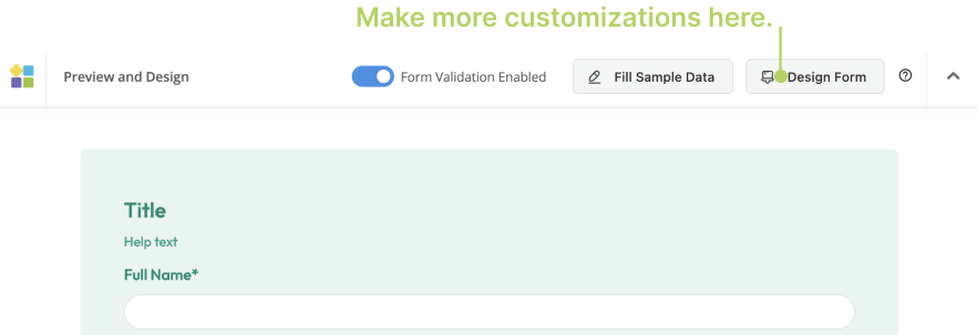
You will open the preview page of your form. Here, you can explore and customize design options for your form.
Apply the themes
To explore the available themes and apply themes to your form:
-
Click the Themes button at the bottom left corner.
You will open the Themes panel, where you can browse the available themes.

-
Select the theme that matches your form’s purpose and preferred look.
Cutomize the form design
You can also make more customizations to the form styles. All changes are instantly previewed.
-
On the form’s preview page, click the Design Form button in the top right corner.
You will open the Design Form panel.

-
Make your desired design changes.
NoteFormCan offers customizable form design properties. Find details in the Form design properties section.
-
After making your desired modifications, click the Save button to save your changes.
Form design properties
| Property | Description |
|---|---|
| Appearance | Change the form appearance:
|
| Logo | Upload a PNG or JPG image, with a maximum size of 10MB.
|
| Navigation Bar | If your form has multiple pages and you enable the Navigation bar, it appears at the top, allowing users to switch between pages. To add pages, insert a Page Break while building your form. |
| Navbar Style | After enabling the Navigation Bar, you can select a suitable navbar style for your form. |
| Help Text | If you’ve added help text, you can choose to position it below the Field or Label. |
| RTL Form | Show the form with a right-to-left reading direction. This is suitable for languages like Arabic, Hebrew, or Persian, which are written from right to left. |
| Rounded Corner | Apply rounded corners to the form to create a smoother and visually appealing look. |
| Material Style | The input boxes in the form will have a straight line design. |
| Form Width | Choose from options such as S, M, L, or Full to determine the width of the form. |
| Form Margin | Select from padding options like None, S, or M to set the spacing between form elements and the form boundaries. |
| Font | Use the system font or import your own font. |
| Font Size | Modify the font size in the form to ensure it’s easy to read and visually pleasing. |
| Line Spacing | Select from options like XS, S, M, L, or XL to adjust the line spacing in the form for better readability. |
| Label Layout | Determine the layout style of the input boxes’ labels. When you choose Customized, you’ll need to return to the Properties panel for each field to adjust its Label layout. |
| Label Width | Define the width of the input boxes’ labels. |
